 (Photo credit: Wolfgang Sauber)
1. Diego Rivera’s “Man at the Crossroads”
The Moral: Never hire a communist to do a capitalist’s job.
During the Great Depression, Mexican artist Diego Rivera was on a roll. In 1931, he painted a massive mural for San Francisco’s Pacific Stock Exchange. And by 1933, he’d completed two more enormous murals of Ford’s assembly line for the Detroit Institute of Arts. But there was a disconnect in Rivera’s work. Although the artist was a vocal and committed communist, his art was decidedly capitalist. After a few friends pointed out the hypocrisy, Rivera decided to put his paintbrush where his mouth was.
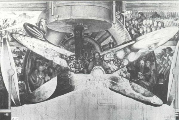
Opportunity knocked in 1932, when the Rockefeller family hired Rivera to create one of his signature paintings in the lobby of the new RCA Building in Rockefeller Center. Their suggested theme for the work was “Man at the Crossroads Looking with Hope and High Vision to the Choosing of a New and Better Future”—an allusion to the crossroads between industry and technology. Rivera’s final product depicted a crossroads, but hardly in the way the Rockefellers had intended. Instead, the sprawling 63-foot masterpiece illustrated two alternate futures: a communist heaven and a capitalist hell.
Rivera might have gotten away with his political statement if it hadn’t been for one detail—he painted his personal hero, Vladimir Lenin, into the piece. When building managers realized Rivera was filling their lobby with Red propaganda, they ordered him to cease and desist. To preserve the art, the Rockefellers asked Rivera to morph Lenin’s portrait into an unrecognizable worker. But when the artist refused (Rivera offered instead to balance the picture with a portrait of Lincoln), he was paid his full fee, then barred from the site. The mural was immediately covered, and months later, workers were ordered to destroy the piece altogether.
 Photograph of the original mural before it was destroyed. (Image credit: Lucienne Bloch)
It wasn’t long before the artist got his revenge. Later that year, Rivera re-created the piece for the Palacio de Bellas Artes in Mexico City. Only this time, he added a portrait to the capitalist side; it was of Nelson Rockefeller, holding a martini glass, under a swarm of syphilitic bacteria.
 2. Robert Arneson’s “Portrait of George”
The Moral: If you’re going to put the Mayor on a pedestal, don’t build that pedestal with Twinkies.
In 1978, after mayor George Moscone and city supervisor Harvey Milk were assassinated, the city of San Francisco wanted to commemorate its fallen leaders. Officials set about building a new convention center in Moscone’s honor, and held a competition for a proper memorial sculpture to be displayed in the lobby. Artist Robert Arneson quickly won over the selection committee with his proposal for a grinning, oversize bust of the slain mayor.
But when the sculpture was unveiled in 1981, it was met with gasps of horror. The audience wasn’t shocked by Moscone’s smiling head, but by its nearly 5-foot-tall pedestal, which was imprinted with five bloody bullet holes and graffiti that read “BANG BANG BANG” and “HARVEY MILK TOO.” Arneson even included an image of a revolver and a Twinkie—a reference to the assassin, Dan White, who’d tried to exonerate himself in court by arguing that junk food binges were to blame for his violent mood swings.
Arneson claimed he was trying to portray the totality of the crime, but San Franciscans wouldn’t have it. Mayor Moscone’s successor, Dianne Feinstein, denounced the work, and the city demanded its money back.
A handful of people did appreciate the sculpture, though. A private collector purchased the piece immediately, and in 1997, “Portrait of George” resold for $155,000. Today, even Feinstein agrees the work would be “appropriate for a museum.” Just don’t count on it showing up in the Moscone Center lobby anytime soon.
3. Horatio Greenough’s “George Washington”
 (Photo credit: Wknight94)
The Moral: Founding Fathers look less distinguished in the nude.
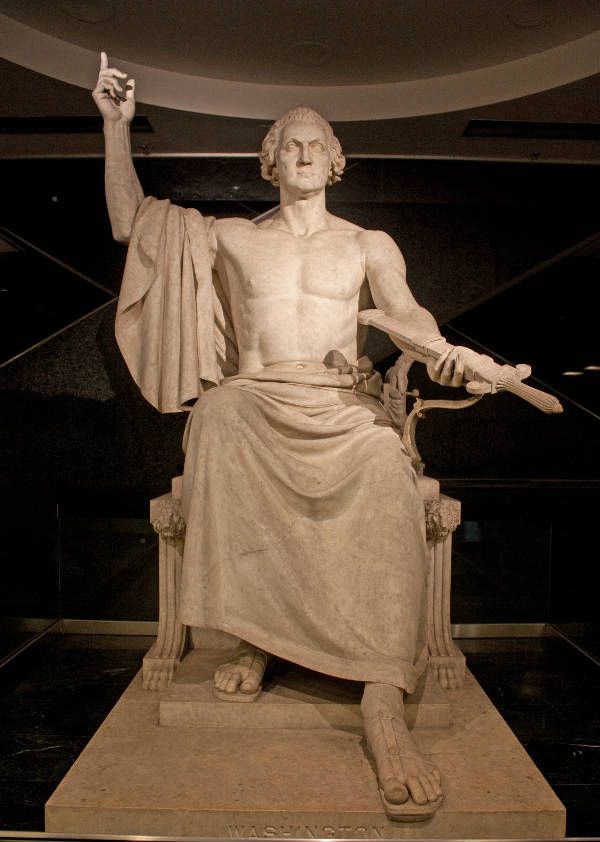
In 1832, Congress commissioned a giant sculpture of George Washington for the 100th anniversary of the President’s birth. They tapped artist Horatio Greenough for the job, and he seemed like a perfect fit. Not only did the Boston native come with a great reputation, but he’d also trained in Rome with the best European artists. Considering Greenough’s background, Congress assumed that his work might be classically influenced. What they didn’t expect was to see the Founding Father on a pedestal, naked as the day he was born.
To be fair, Horatio Greenough had good intentions. Inspired by ancient depictions of Greek gods, the artist wanted to portray America’s first president with the strength of Zeus, bestowing power on the people. But when Greenough unveiled his work in the Capitol rotunda, the audience didn’t get it. Instead of greeting the statue with thunderous applause, onlookers simply gawked and snickered at the half-naked George Washington. Wrapped loosely in a toga, the president looked out of character with his nipples and belly button exposed. Worse still, Washington’s arm was extended outward in a grand gesture, and many in the crowd joked that the embarrassed president was trying to reach for his clothes.
Congress was outraged. They tried to relocate the piece, eventually sticking it on the east lawn of the Capitol. By 1908, however, politicians had acquired a sense of humor about the sculpture, and the statue was moved to the Smithsonian. Today, it can be seen in all its naked splendor at the National Museum of American History.
4. David Černý's “Entropa”
 (Photo credit: Flickr user Cea.)
The Moral: Not everyone appreciates racist, nationalist humor.
On January 1, 2009, the Czech Republic took over the revolving presidency of the European Union, and to commemorate the event, the government turned to Czech artist David Černý. For his piece, Černý proposed working with 26 other artists, one from each EU member nation, to create a grand monument. But when “Entropa” was unveiled on January 12, the international community was scandalized. Rather than celebrating Europe, “Entropa” mocked each and every country.
“Entropa” is a huge map in which each nation is represented as a stereotype. Some are silly; others are blatantly offensive. Romania is depicted as a Dracula theme park; Germany is a network of motorways that resembles a swastika; Sweden is a large, IKEA-style box; Bulgaria is a collection of squat toilets.
Upon seeing the work, the Bulgarian government immediately issued a formal complaint. The controversy grew when newspapers noticed that Černý's “team” of international artists was nowhere to be found. Černý soon admitted that they didn’t exist; his only collaborators were his two assistants. Outraged, Czech officials accused him of misappropriating state funds, but Černý insisted that he’d always intended to return the money. Three days later, when the work was ceremonially presented to the public, Černý formally apologized to the Czech government. He said his intention was “to see if Europe is able to laugh at itself.” Apparently, it can’t.
_______________________
 The article above, written by Elizabeth Lunday, is reprinted with permission from the July-August 2010 issue of mental_floss magazine. Get a subscription to mental_floss and never miss an issue!
Be sure to visit mental_floss' website and blog for more fun stuff! ![]()


