Video game company logos, as logos for any company, evolve and update if they are lucky enough to survive enough years. Geekosystem has a look at how they've changed. Most of these logos look much better now.
Link
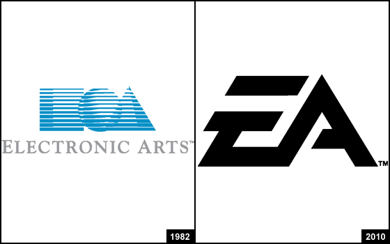
Apparently, EA’s old logo confused people.Wikipedia: “Many customers mistook the square/circle/triangle logo for a stylized “EOA.” Though they thought the “E” stood for “Electronic” and “A” for “Arts”, they had no idea what the “O” could stand for, except perhaps the o in “Electronic.” An early newsletter of EA, Farther, even jokingly discussed the topic in one issue, claiming that the square and triangle indeed stood for “E” and “A”, but that the circle was merely “a Nerf ball that got stuck in a floppy drive and has been popping up on our splash screens ever since.” It’s still enough to induce waves of nostalgia in anyone who’s played Starflight.
Link
Newest 2 Comments
If you look carefully at the cover art for vintage EA games, you can usually find hidden somewhere a properly-sized square, circle and triangle.
Abusive comment hidden.
(Show it anyway.)
Man that makes me feel old! I remember most of them and still have many of their games going back to 1983. Always wondered about the "O" in EA's logo as well :)
Abusive comment hidden.
(Show it anyway.)