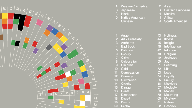
Graphic designer David McCandless made an infographic that describes connotations associated with different colors in different cultures. It serves as the cover illustration for Information is Beautiful, a book of infographics that McCandless and other designers have composed. Pictured above is one small part of the much larger whole.
Link via Fast Company
They missed out on a pile of common connotations, and I agree - the format is *terrible*. Typical case of someone thinking they're clever when they're not.